

Google's Brand Makeover
Google is back with yet another rebranding of its office suite apps, formerly known as G-Suite. This is Google's fourth office suite rebrand since its introduction in 2006. What originally started as Google Apps for your Domain quickly became Google Apps for Work followed by its most notable G-Suite and now Google Workspace.
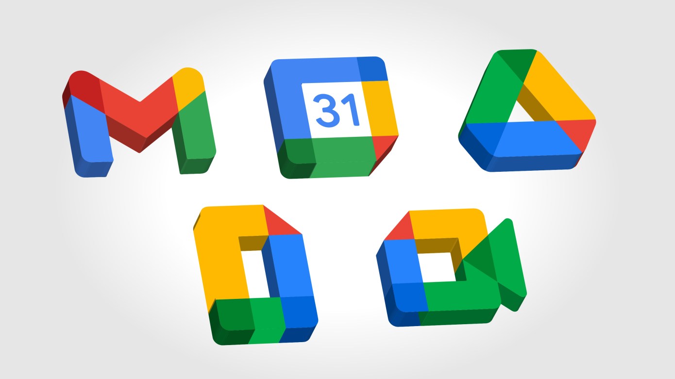
The idea to rebrand came from the incentive to create a “better home for work.” As more businesses began working remotely, Google saw the need for a more cohesive and integrated platform. However, this backfired shortly after the launch earlier this month when they received backlash, not because of the application functions, but for their icon makeover.
The traditional Google icons users have come to recognize have been reimagined, making them more bold and colorful, and people are beside themselves for the simple fact they cannot tell them apart.
In an article reported by TechCrunch, a tech-savvy news outlet, they were not shy in discussing their disappointment, stating, “Google really whiffed on the new logos for its ‘reimagination’ of G Suite as Google Workspace, replacing icons that are familiar, recognizable, and in Gmail’s case iconic if you will, with little rainbow blobs that everyone will now struggle to tell apart in their tabs.” Many other subscribers of TechCrunch chimed in with their frustrations. Some even went to the extent of recreating the logos themselves.
What started as an incentive to make working from home more seamless quickly became a design nightmare, bringing us to our topic of discussion. What do you think about Google's brand makeover? How should they handle this from a PR perspective? Should they push the negativity aside, or surrender and try again? Let us know!